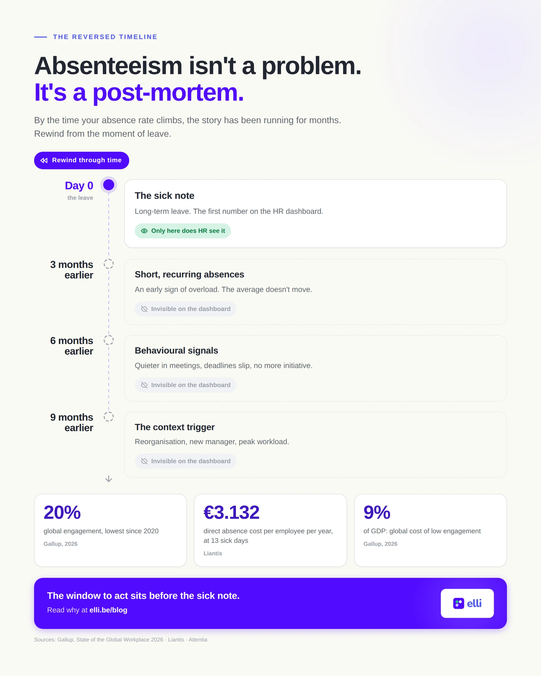
Sick leave isn’t a problem. It’s a post-mortem.
By the time your absence rate climbs, the real story has been running for months. The sick note isn’t the start of a problem. It’s the end of a trajectory that was measurable long before, only nobody was looking in the right place.
Most organizations treat absence as the headline measure of wellbeing. The quarterly figure rises, a working group is formed, a policy is written. All of it useful, but all of it happening at the worst possible moment: after people have already dropped out. Sick leave is the most expensive and slowest way to discover that your engagement started falling a year ago.
The reversed timeline
Run the film backwards. An employee is on long-term leave with burnout. Rewind three months: there were two short absences of a few days each. Rewind further, to six months earlier: she went quieter in team meetings, pushed deadlines more often, stopped taking initiative. Further still, nine months back: her team changed managers and the workload doubled after a reorganization.
Every one of those moments was a signal. Not one of them showed up on an HR dashboard. The first figure the organization saw was the sick note. And by then we’re talking about months of lost time, in which a conversation, a redistribution of work, or an adjustment to the role could have made the difference.
This isn’t an anecdote but a pattern. In a recent analysis of absence data, Attentia describes how sick leave is almost always an individual trajectory: people gradually shift from a stable pattern to a risk pattern, and that tipping point has a timing and a context. A change of team, a workload peak, a new manager. The absence itself is only the visible endpoint.
Why your dashboard doesn’t see this
Classic absence reporting works with averages: a percentage per department, a trend per quarter, a benchmark against the sector. That macro story has its uses for reporting, but it’s almost by definition blind to early signals.
Attentia names the fallacy at play here: the ecological fallacy. You take a group-level average and read it as if it says something about individuals. The most dangerous variant is an absence figure that stays perfectly stable while the make-up underneath it shifts: fewer long absences, but more and more people with short, recurring episodes. That pattern is a textbook early signal of overload, and it doesn’t move the headline percentage. Your dashboard says “all fine” while a team is sliding.
As long as you only look at the average, absence data lets you watch, but not steer. The question “how do we score against the sector” produces no action at all. The question “who is moving in which direction, and since when” does.
What looking too late costs
The bill for that late look is by now well documented. Liantis calculated the direct cost of absence in Belgium at an average of 1,596 euros per blue-collar worker and 3,132 euros per white-collar employee per year, and that’s only the direct part. On top come lost productivity, replacement costs and the added pressure on colleagues, with the risk of secondary absence: team members absorbing the gap become overloaded themselves and drop out in turn. One late-detected trajectory becomes a chain reaction.
And the underlying current isn’t shrinking. In its State of the Global Workplace 2026, Gallup measures that worldwide only 20% of employees are engaged, the lowest level since 2020 and the second declining year in a row. Gallup puts the price of that low engagement at some 10 trillion dollars in lost productivity, roughly 9% of global GDP. A striking detail: the decline is steepest among managers themselves, precisely the group that should be catching the early signals in teams.
The window between signal and sick note
Between the first signal and the long-term absence there’s usually a window of months. That window is the only place where prevention deserves the name. Attentia frames it as the shift from “where do we stand?” to “who is evolving in which direction, and when do we see the tipping point?”. Who is sliding from stable to worrying. In which teams the inflow into risk patterns is structurally higher. Whether a tipping point coincides with a reorganization or a new manager.
Those are questions about time and direction, not about levels and benchmarks. And they’re exactly the questions an annual survey or a quarterly report can’t answer. One measurement a year gives you a single photo of a trajectory that moves for months. Whoever has only photos sees no direction.
The window is there on the engagement side too. Disengagement precedes absence: energy dips, involvement drops, the first short absences appear. Whoever tracks engagement and energy continuously at team level sees the movement while it’s happening, and can step in before the threshold into long-term leave. Whoever waits for the absence figure reads the report after the fact.
Absence as a lagging indicator, engagement as a leading indicator
The conclusion is uncomfortable but freeing: your absence figure is not a steering instrument. It’s a delayed measurement of decisions and signals from the past. Treat it that way. Report on it, benchmark by all means, but steer on what runs ahead: the energy, the involvement and the early behavioural signals in your teams, and above all the direction they’re moving in.
For HR teams that means a different reflex. Not: “our absence sits below the benchmark, so it’s fine.” Rather: “which teams are moving in the wrong direction, and what are we doing about that tipping point this month?” The difference between those two questions is the difference between a post-mortem and prevention.
Preventing dropout doesn’t start with the absence policy. It starts with seeing the movement that comes before it.
Sources
- Attentia, The many faces of absence data: avoid these classic fallacies (Arne Coutteau, lead analytics, April 2026): attentia.be
- Liantis, Absenteeism in your organization costs more than you think (November 2025): blog.liantis.be
- Gallup, State of the Global Workplace 2026 and Global Employee Engagement Continues Decline (April 2026): gallup.com